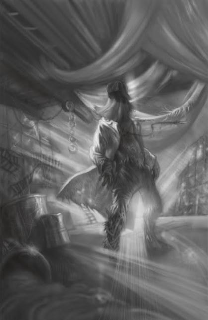
 This was the first image I paid Lothar to paint for the illustrations. The first one he did depicted Soleil utilizing his toxic poncho, but we didn’t collaborate on that one; it was just an introduction to give me an idea of his skills. That’s the reason the image of Soleil doesn’t have much going on in the background. Lothar didn’t know what kind of imagery to use to capture the character’s personality so he just used a blend of light and dark colors. Before he started Inspector R.E.D. he requested a description of the character, a brief backstory, and some ideas for a setting. I figured I’d just email him a portion of the chapter where I described what Inspector R.E.D. wears and having Lothar pain a generic background like he did with Soleil. This is the first time I’ve explored the option of illustrations so I really didn’t know what to expect. This was when I started getting a handle on the information necessary for putting pictures in books, and how complicated they can become. We had a long discussion of where Inspector R.E.D. should be in the image. The first time the readers were introduced to him was in a cemetery in Made to Be Broken, but he was murdered in an abandoned store, and took his revenge in a factory where his killers work. We decided to go with the factory since that is a high action moment in the book, focuses on Inspector R.E.D.’s motivations, and Lothar thought it would be the most fun to paint. We also talked about what kind of factory it is, what sorts of machines and materials would be present, and the condition of the building overall. This is how it will look in the book since it can only be printed in black and white, but there is a colored version in the works. I’m looking forward to how that one comes out.
0 Comments
Leave a Reply. |
Author
|
 RSS Feed
